A decade-overdue redesign of Pakistan's most-used telecom app — simplifying core journeys for 50M+ subscribers, delivering 18% YoY user growth and a 34% increase in digital recharge within months of the initial core feature launch.
Product
My Telenor App (MTA)
Type
Telecom Self-Service
Scale
50M+ Users
Role
Product Designer
Platform
iOS & Android
01 — Overview
What We Built & Why It Mattered
My Telenor App (MTA) is Telenor Pakistan's primary self-service channel, a digital touchpoint enabling over 50 million subscribers to manage SIM services, data and voice bundles, account balance, usage, and subscriptions. The product supports high-frequency actions such as recharge, bundle purchase, and account management.
The app had not received a fundamental redesign in over a decade. Cluttered screens, inconsistent navigation, duplicate features, and deeply nested flows had accumulated into an experience that actively created friction. I co-led the end-to-end redesign of core journeys : Home, Packages, Easy load, and more working alongside Syed Muddassir, collaborating on key features while each owning separate areas of the product.
50M+
Users on the platform
18%
YoY user growth post core launch
10+
Years of design debt resolved
02 — The problem
The Decade of design debt
The original app was built feature-by-feature over many years with no single design system and no regular usability audits. The result was an experience that technically worked but actively created friction for users trying to do the simplest things.
Poor Information Hierarchy
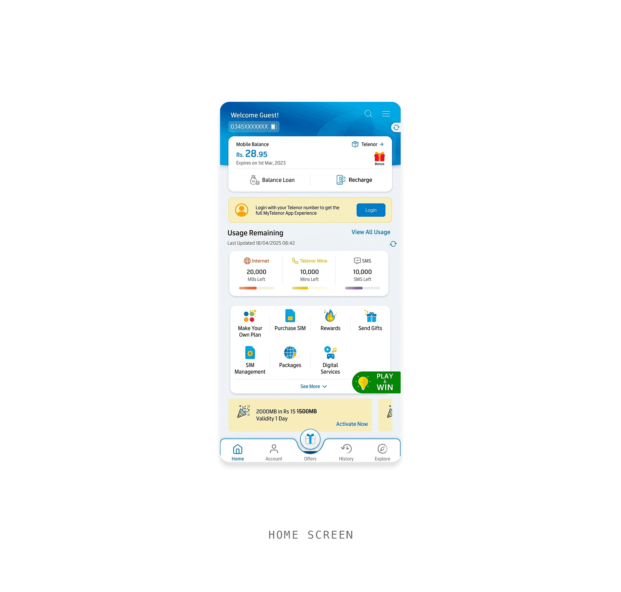
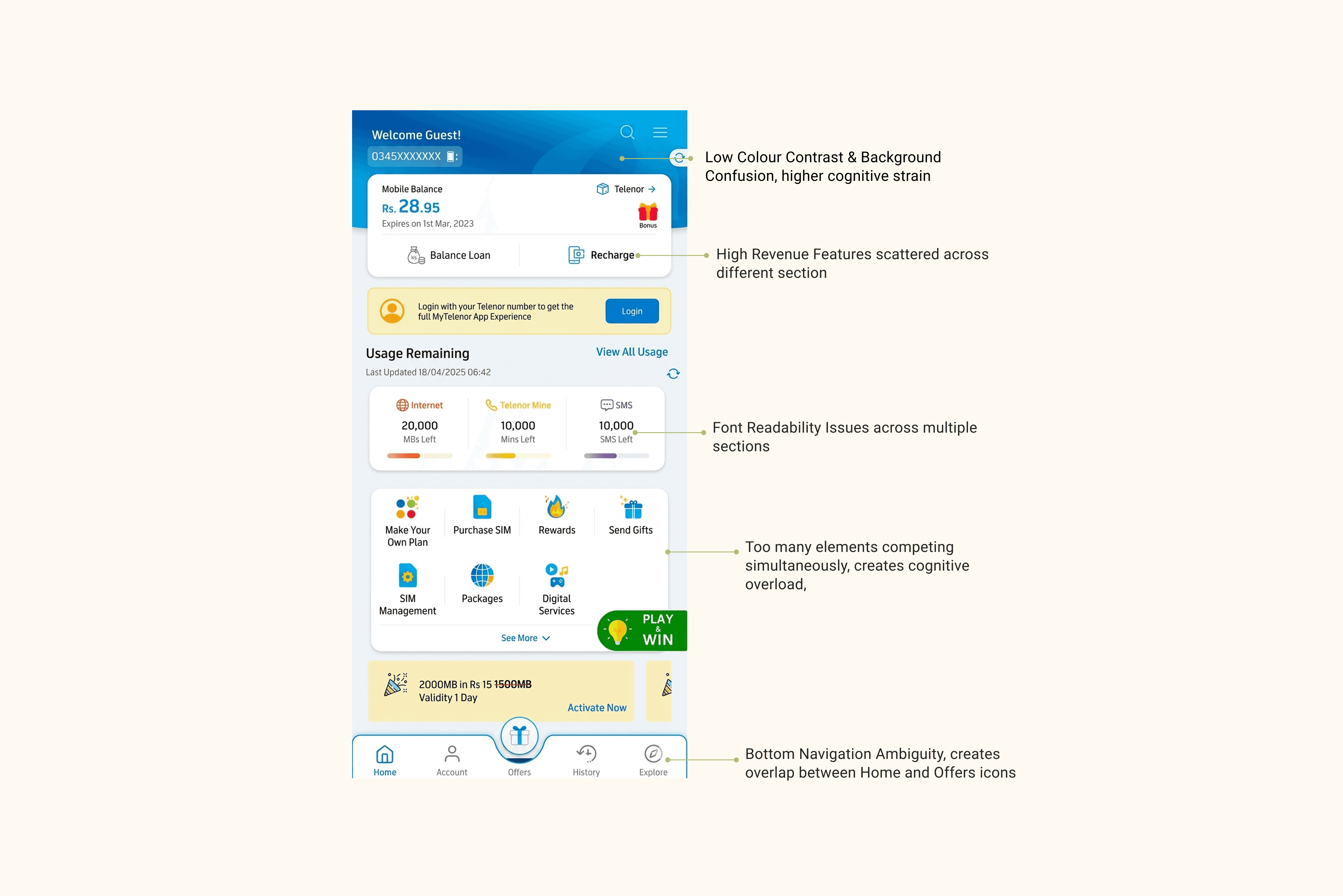
The Home screen treated everything as equally important. Balance, navigation shortcuts, promotions, quick actions, usage data, all rendered at the same visual weight. Users spent an average of 5–8 seconds just orienting before taking any action. That's not navigation that's confusion.
Complex Journey's
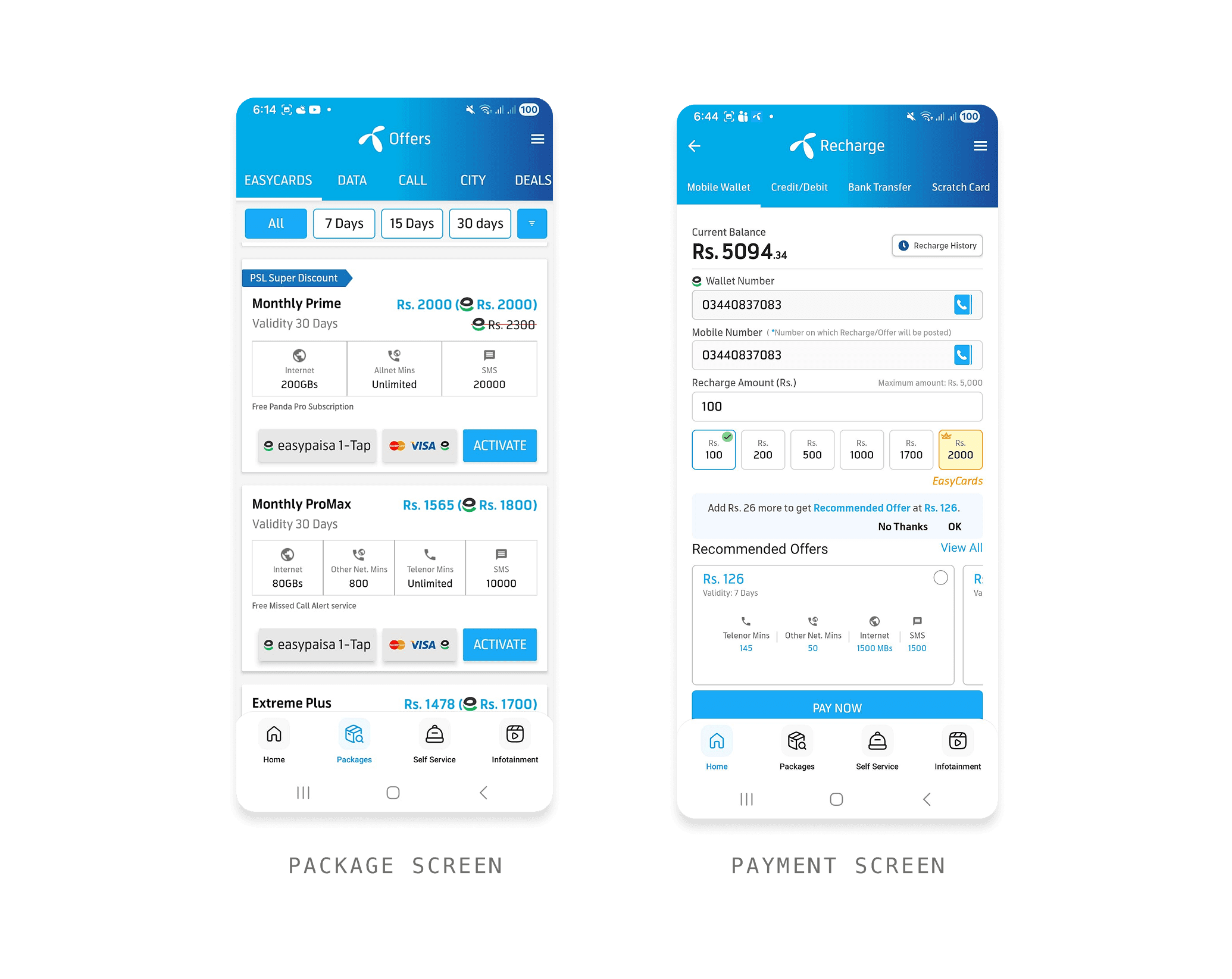
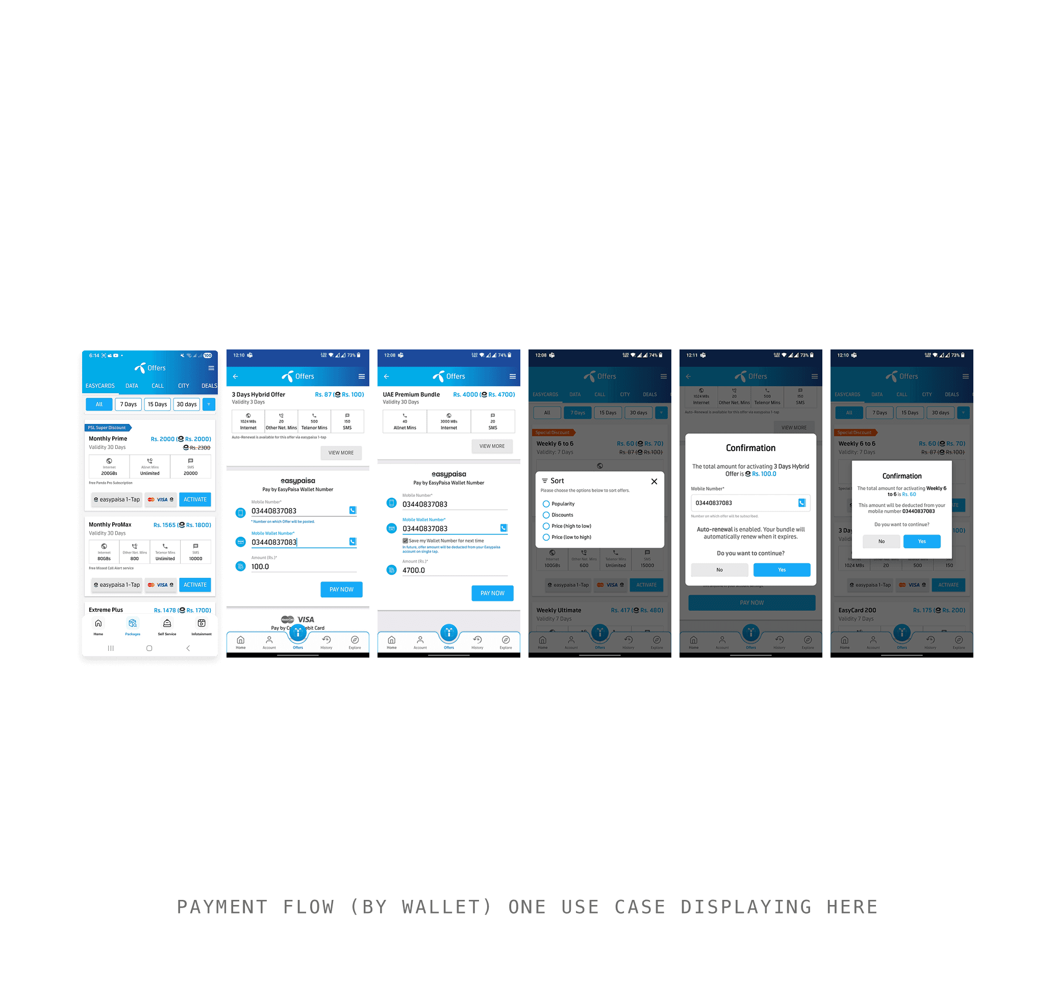
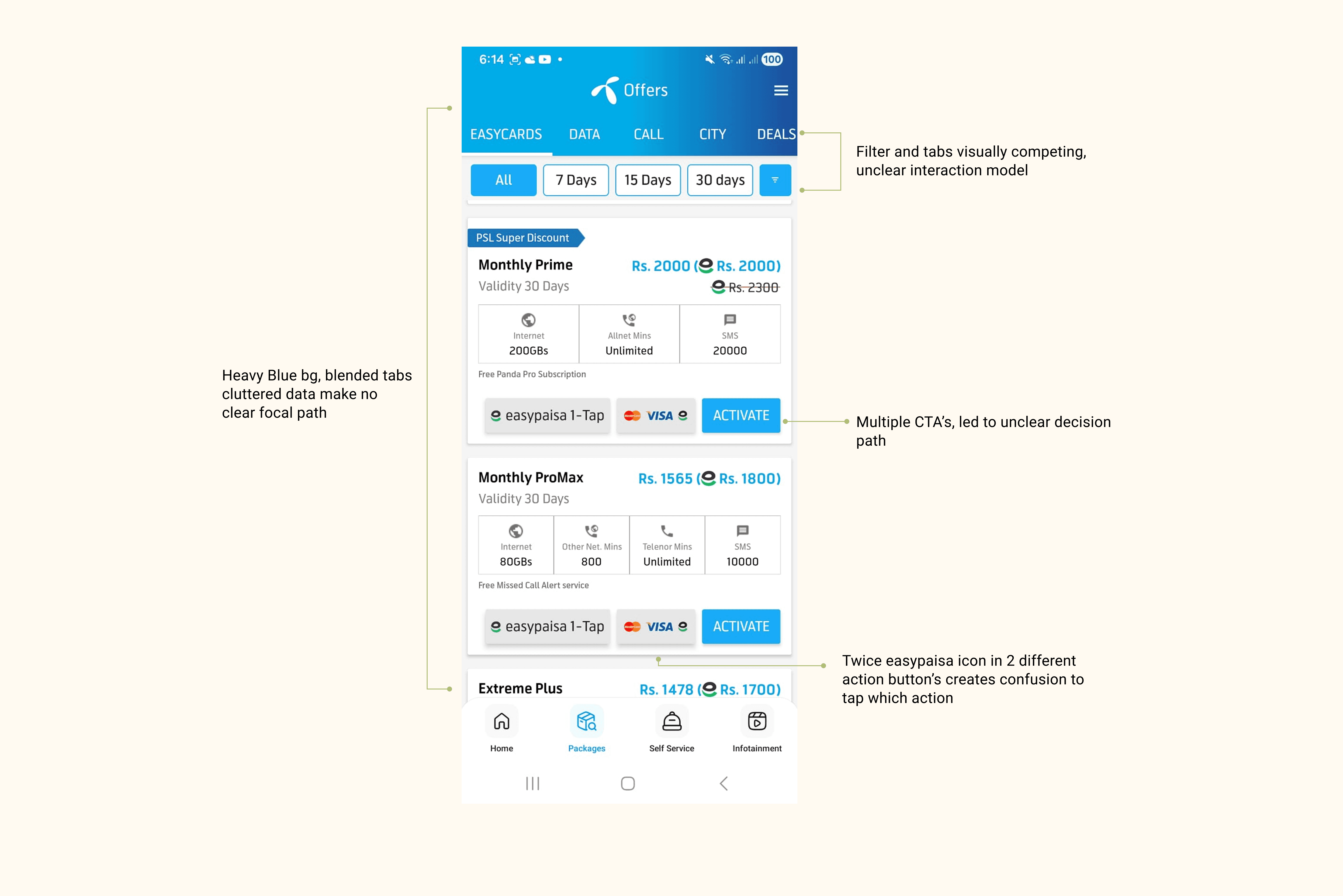
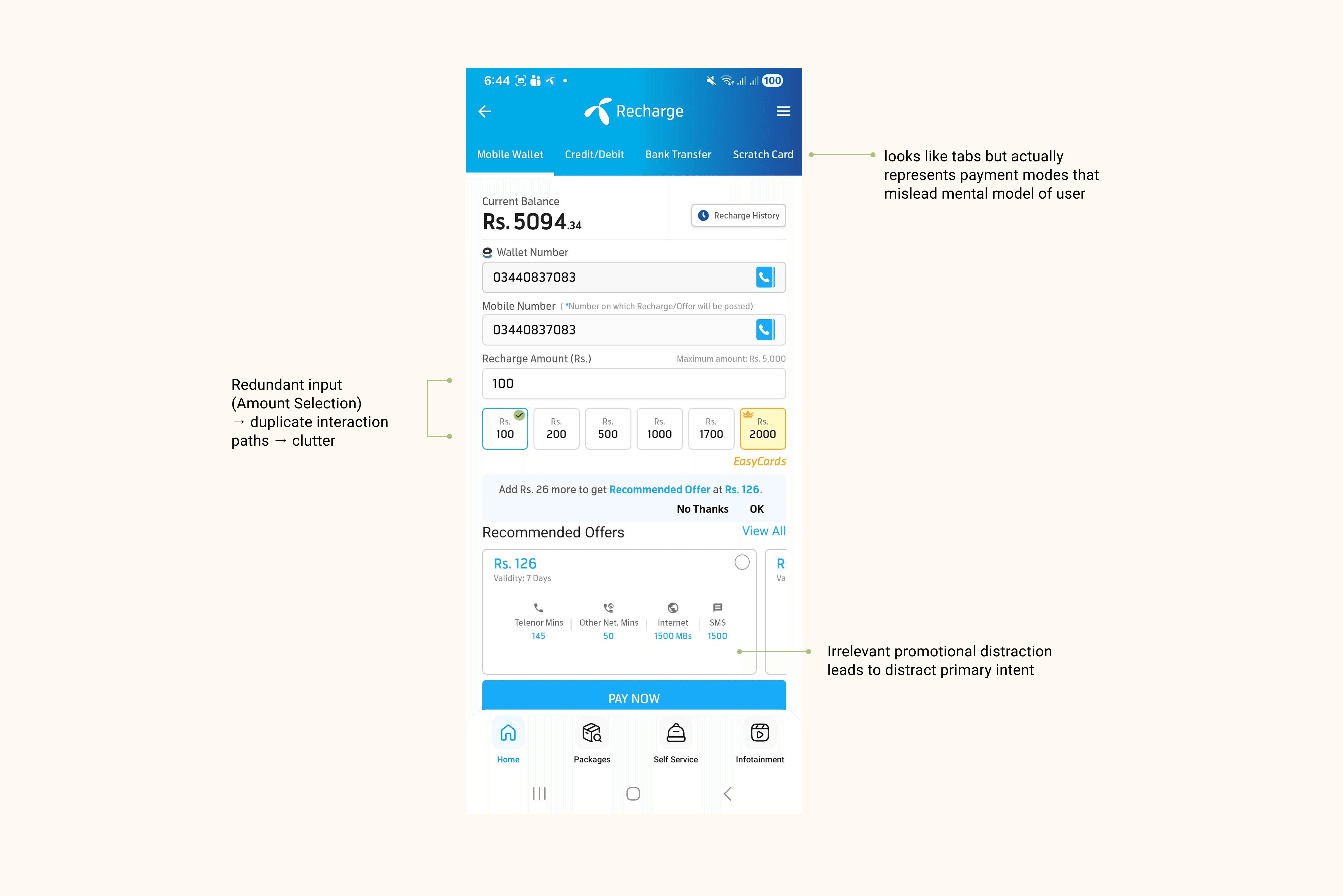
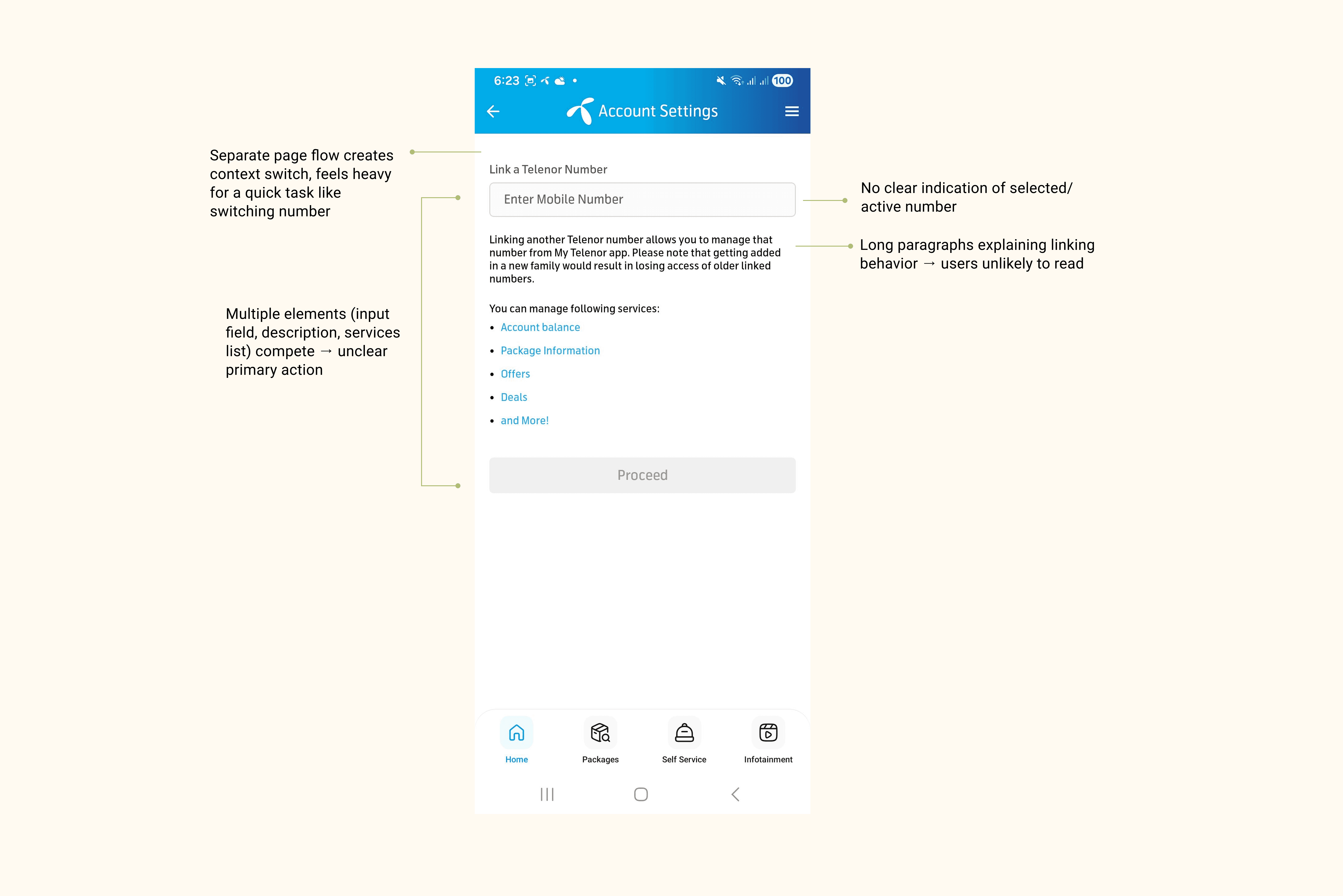
Packages and Payment flows the app's most important revenue-generating features were fragmented across multiple nested screens with no clear progression, no status feedback, and multiple confirmation steps showing the same information repeatedly. Users consistently abandoned mid-flow because the path to completion was never clear.
Redundant Features
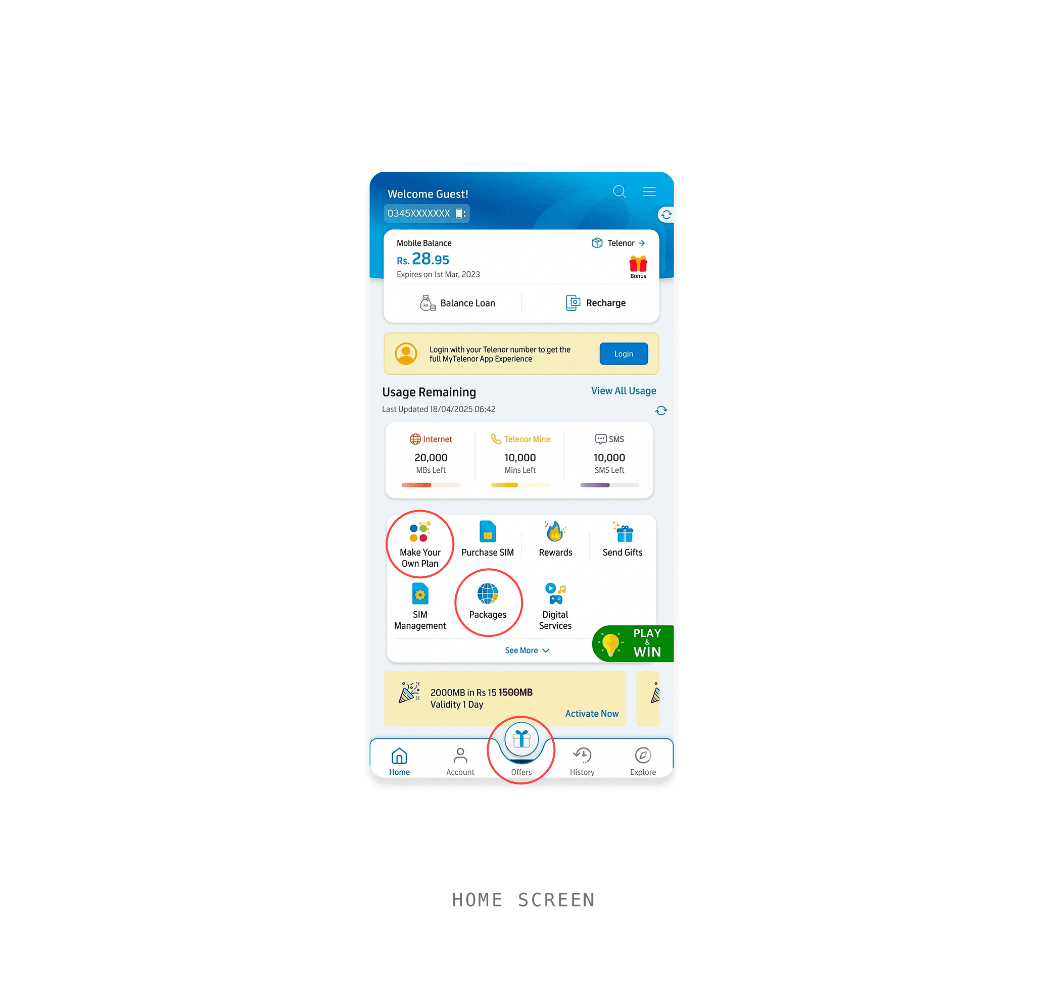
On the original Home screen, "Offers," "Packages," and "Make Your Own Plan" all led to the same destination the package browsing experience. Three entry points for one feature created uncertainty about which was the "right" one to tap, diluting user confidence.
Outdated Visual Language
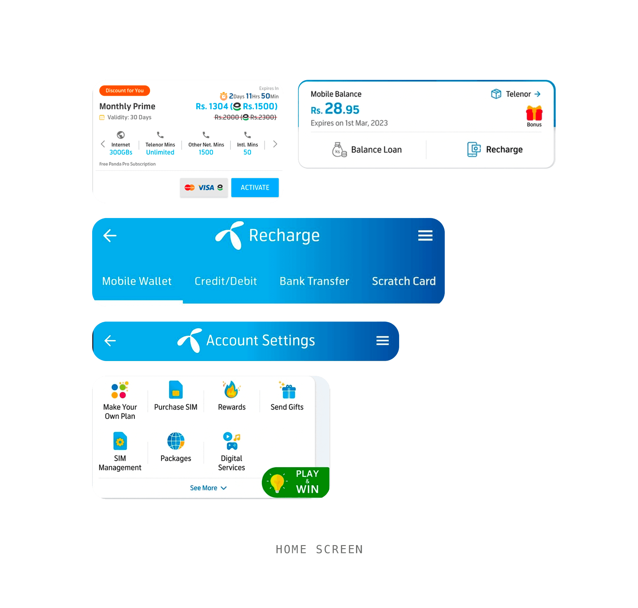
Heavy blue gradients dominating the header, inconsistent tap target sizes, dense icon-heavy grids with no visual breathing room, and font sizes as small as 8pt in critical UI
Business Impact
Every added step, every moment of confusion, every abandoned mid-flow session represents a missed transaction on Pakistan's largest telecom platform. Drop-off during package subscription was concentrated at the midpoint of a deep nested flow.
03 — Role & Responsibilities
What I Owned
I co-led the MTA redesign with Syed Muddasir, within a cross-functional team of PMs, engineers, and a QA lead. We each owned separate feature areas while collaborating closely on shared flows and system-level decisions.
04 — Research
Finding Ground Truth
Given the constraints — an internal redesign without access to live analytics — I structured a lean but rigorous research approach around available inputs.
Method 01
Heuristic Evaluation (Nielsen's 10)
Conducted a systematic, screen-by-screen audit of the live app. Across the Packages flow alone, multiple violations were identified most critical: Visibility of System Status (no purchase progress indicators), Error Prevention (one-tap auto-renewal disable with no warning), and Recognition over Recall (navigation without labels).
Method 02
Competitive Benchmarking
Benchmarked against Jazz World and Zong My App. The key distinction wasn't tab count but visual clutter presented before the user scrolls. Competitors presented far less information density above the fold, reducing cognitive overload.
Method 03
Stakeholder Inputs & User Signals
Despite repeated requests, stakeholders did not share internal session heatmaps or drop-off analytics. We relied on structured stakeholder inputs, Google Play Store reviews (pattern-coded by complaint theme), and direct user complaint data. One critical finding: the existing FAB 'Play & Win' button drove approximately 1 million daily taps. Its removal caused a measurable decline in indirect revenue, reinforcing the need to design intentionally before removing features.
Method 04
Stakeholder Interviews
Spoke with product leads and CS team representatives. Key insight: the most common complaint themes were can't find my balance, i' 'don't know how to activate a package,' and confusion around auto-renewal all direct IA and discoverability failures.
Key Constraints
The redesign operated under multiple layers of constraint. The first was the existing backend architecture, most features were already built around the CBS (Core Banking System), Telenor's telco management software, which defines what data can be surfaced, how user flows are structured, and what actions are technically possible.
A concrete example: if a user adds members to a Family Package, the CBS does not allow removing or limiting individual members later, even if a competitor like Zong offers that capability. Similarly, Auto Renewal behaviour is locked once set to a number, unlike YouTube subscriptions where payment details can be changed mid-cycle.
05 — Insights & Design Outcomes
9 Features. 9 Gaps. Clear Direction.
Research was translated into a structured feature-by-feature audit mapping each problem to a measurable design outcome, business impact, and the UX principle applied.
06 — Goals
What Success Looked Like
Business Goals
◆
Drive 18% YoY user growth through improved retention and task completion
◆
Increase 34% digital recharge transactions
◆
Reduce dependency on customer support by making core journeys self-explanatory
◆
Create a scalable design system for future feature additions
◆
Reduce session abandonment on core monetisation screens
User Goals
◆
Know remaining balance at a glance, within seconds
◆
Find and activate a package with minimal steps
◆
Complete Easyload without second-guessing the flow
◆
Understand what each navigation tab contains before tapping
◆
Complete tasks confidently without needing external help
07 — Information Architecture & Sitemap
Restructuring the System, Not Just the Screens
The most impactful design work wasn't visual it was structural. Before any screen was designed, a full sitemap was created to map every entry point, user state, and navigation path across the app. The sitemap accounts for three distinct user states are Guest, Prepaid, and Postpaid each with a different Home experience and feature access.
Site Map

Before
After
Before
After
Before
After
Before
After
08 — UI Design
Visual Decisions That Serve Function
10 — Final solution
The Redesigned Experience
The final solution is a coherent, modern reimagining of MTA's core experience — without adding a single new feature. Every improvement came from reorganisation, hierarchy, and intentional interaction design.
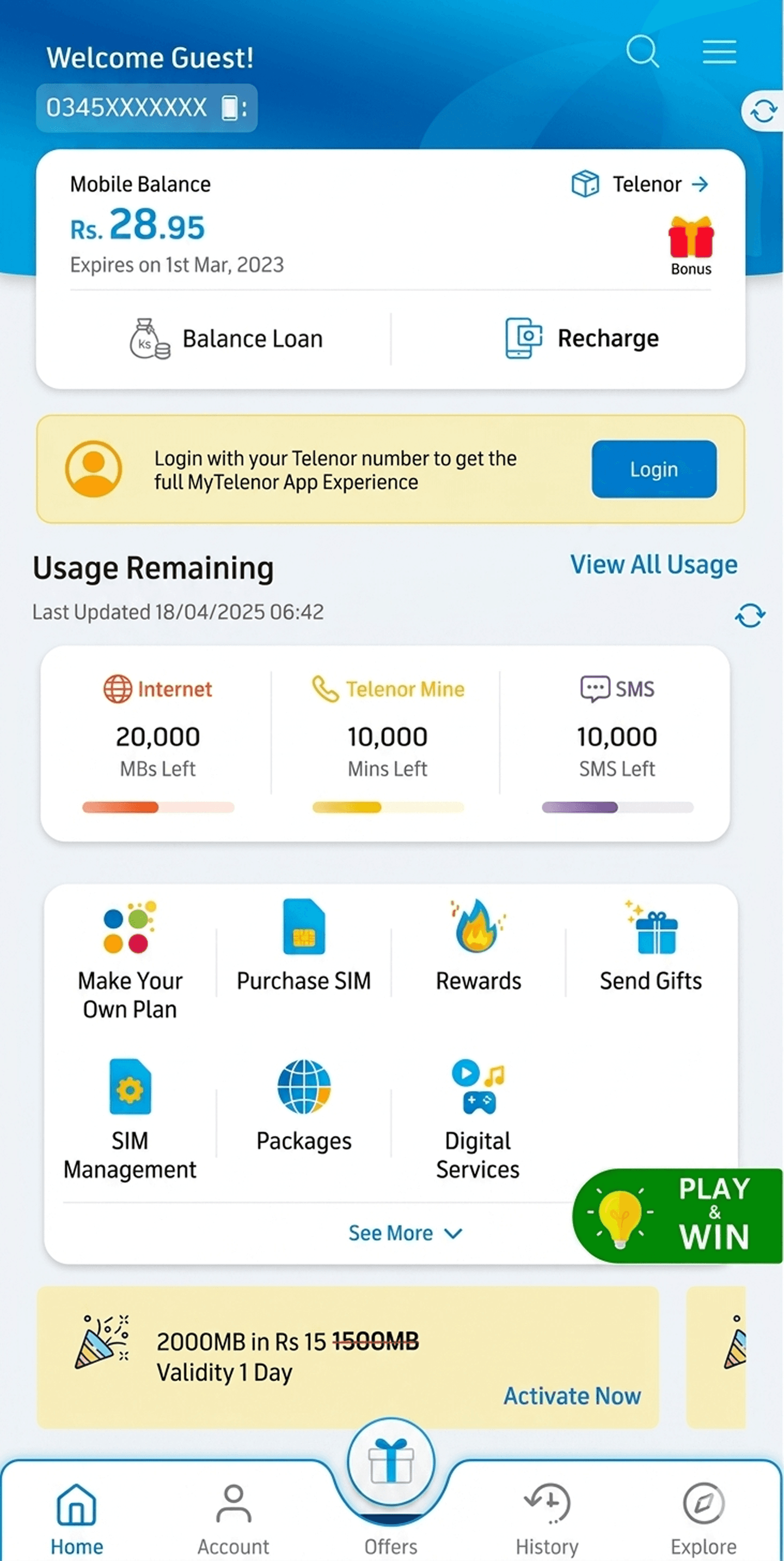
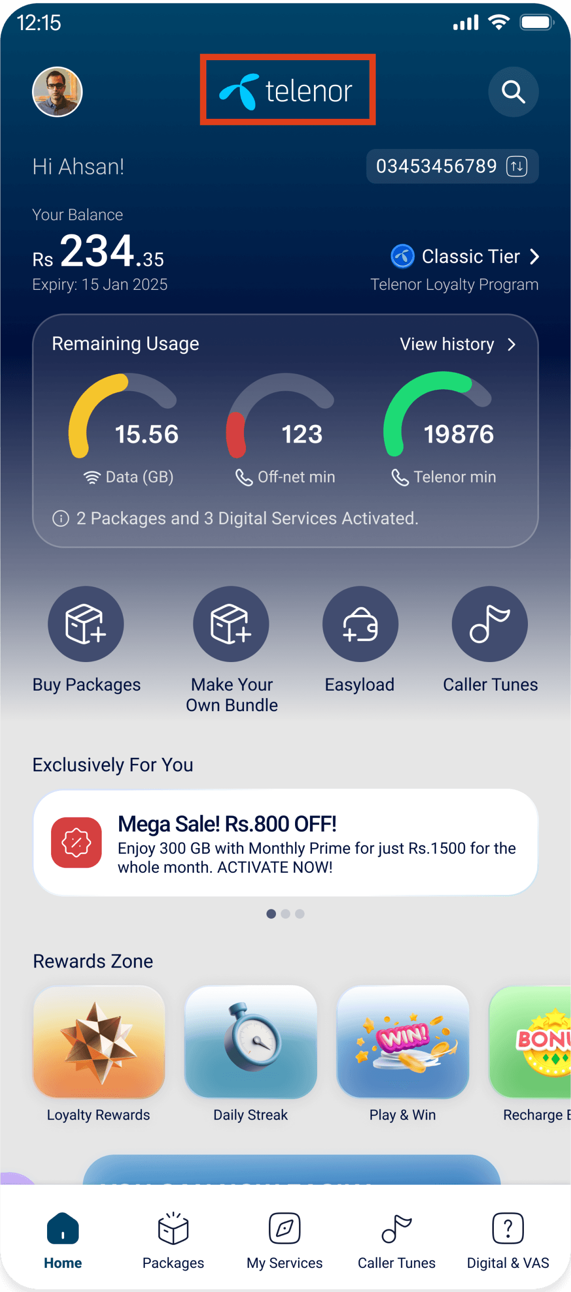
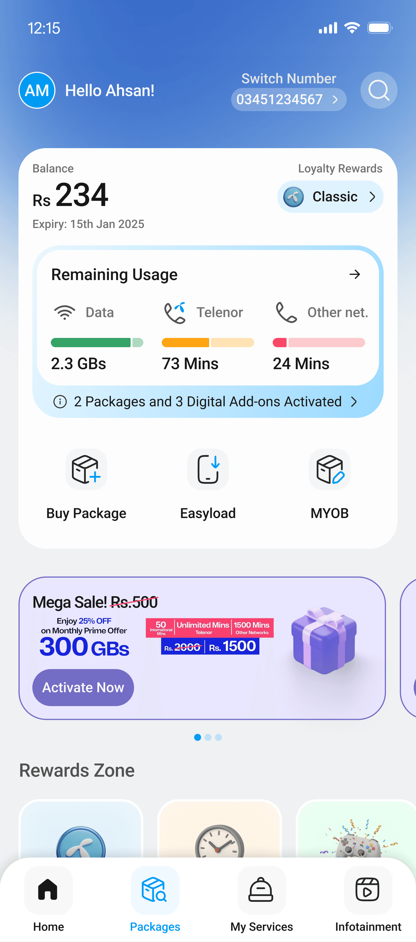
Home Screen — A Three-Stage Journey
Of all the screens in the app, the Home screen took the longest to reach its final form — over four months of iterations, reviews, and internal alignment.
Stage 01
2012 – 2025
Old Design
Live in market before project started
—
14+ items competing for attention above the fold
—
Outdate Visual Hirerachy
—
Packages feature surfaced three times: Offers, Packages, Make Your Own Plan
—
"Play & Win" FAB generating ~1M daily taps
Stage 02
Version 01
Redesigned V01
Re-audited, not launched to development
—
Improved structure — a clear step forward from the original
—
Some visual choices retained at stakeholder request despite recommendations
—
My Services appeared as a standalone navigation tab
—
Circular donut charts for usage data
Stage 03
Version 02
Redesigned V02
Developed and launched
—
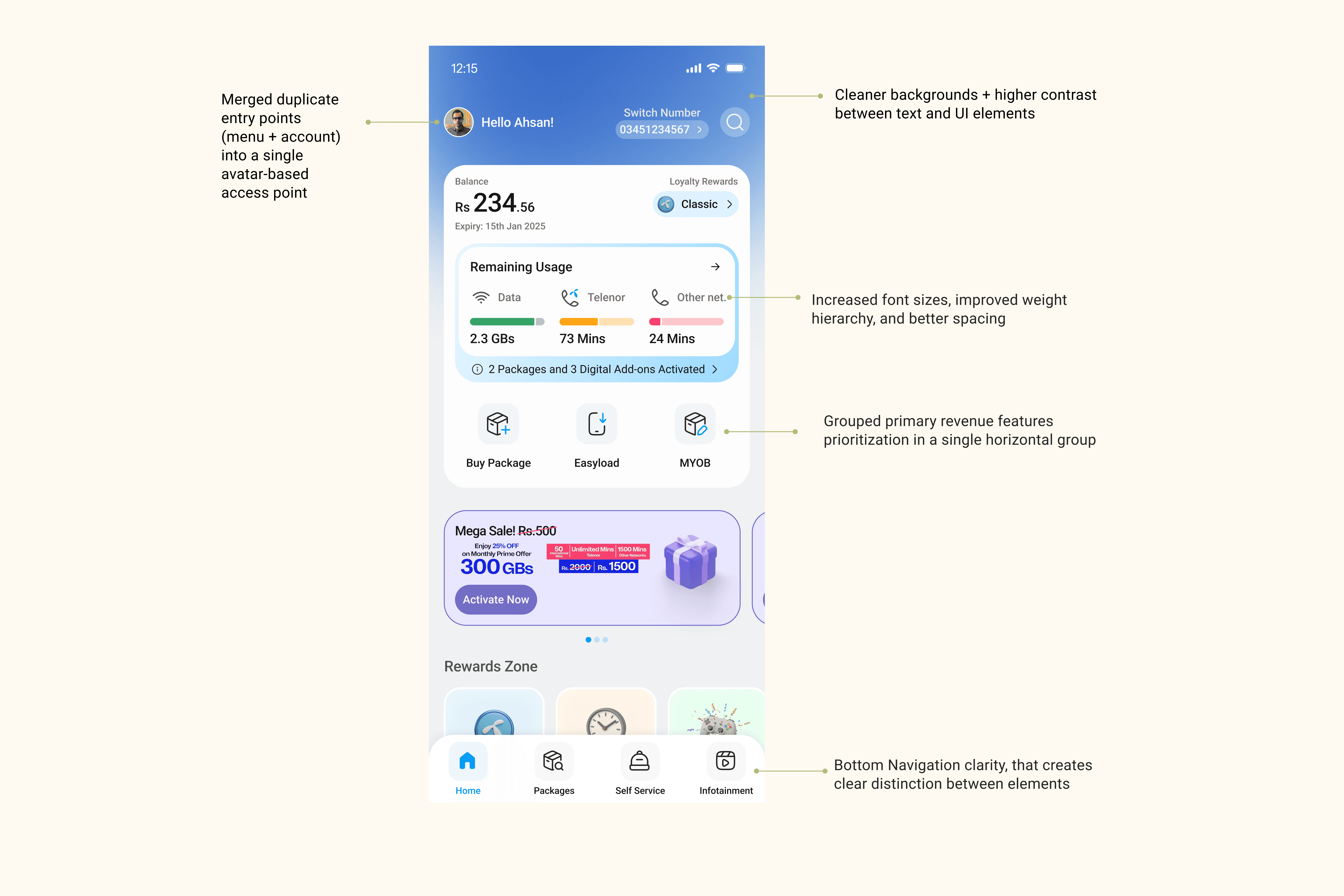
Balance surfaced as a large, scannable hero element
—
Horizontal progress bars replace donut charts — comprehension in under 2 seconds
—
Three-way packages redundancy resolved: single 'Buy Package' CTA
—
4-tab navigation: Home, Packages, My Services, Infotainment
The Pivot from V01 to V02
Version 01 represented a genuine improvement over the original, but it carried unresolved usability debt. Despite repeated design recommendations, certain visual decisions were retained from the stakeholder's direction — including high-contrast colour usage, circular usage charts, and very small font sizes.
The turning point came during a review meeting with the CMO. Rather than framing it as a design preference debate, the approach was to ground the conversation in real user context: a Telenor subscriber urgently needing to recharge in a busy street, under direct midday sun, with poor eyesight.
The CMO paused V01 from moving to development and approved a second redesign pass. This is what good design advocacy looks like — not overriding stakeholders, but finding the right moment, the right context, and the right argument to move the work forward in the user's interest. The Home screen alone took over four months across both versions.
View Home Screen Re-Audit →
Navigation
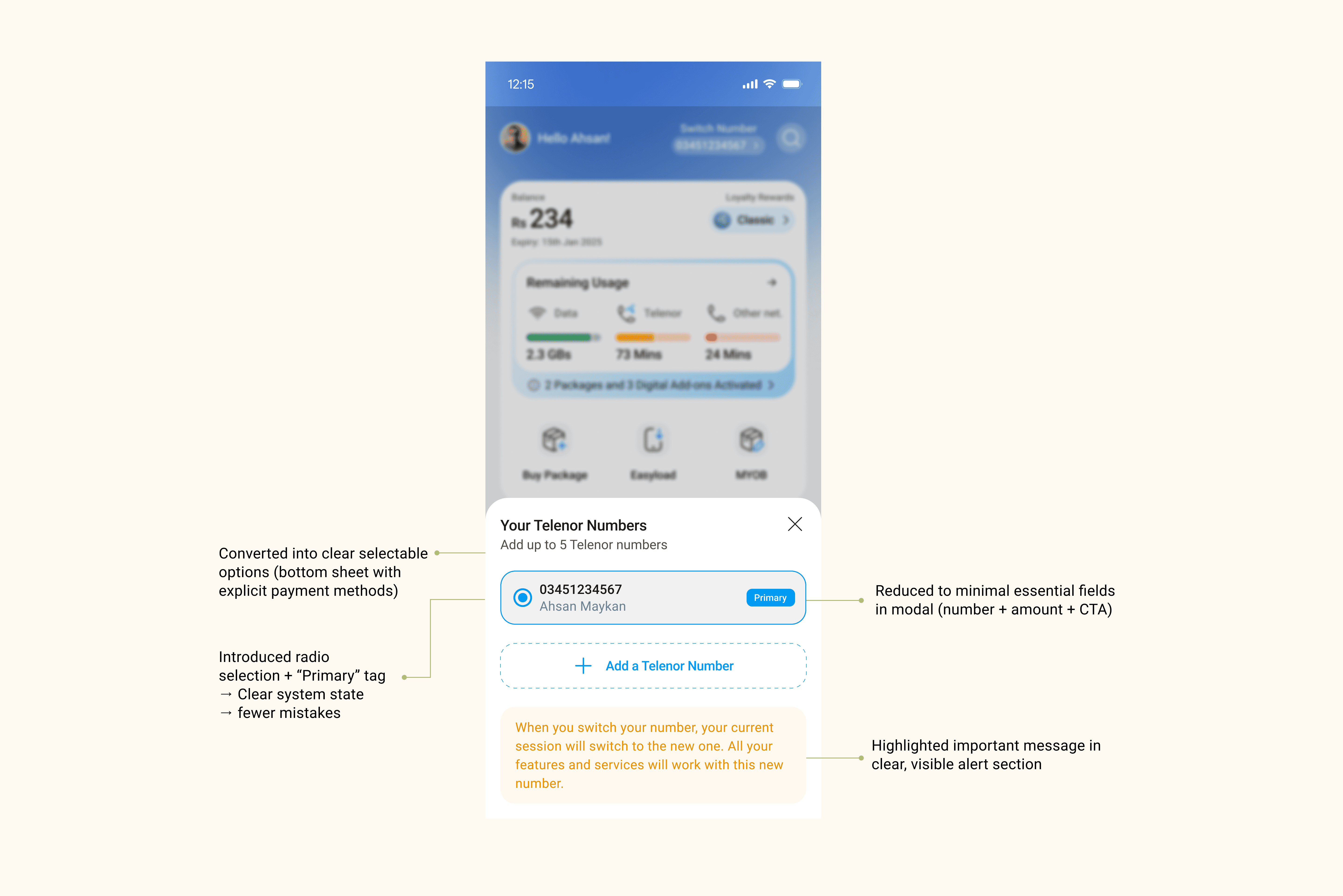
The tab bar moved from 5 tabs to 4 contextually grouped tabs: Home, Packages, My Services, Infotainment. The taxonomy now reflects how users think about the app — not how Telenor's internal product divisions are structured.
Packages Flow
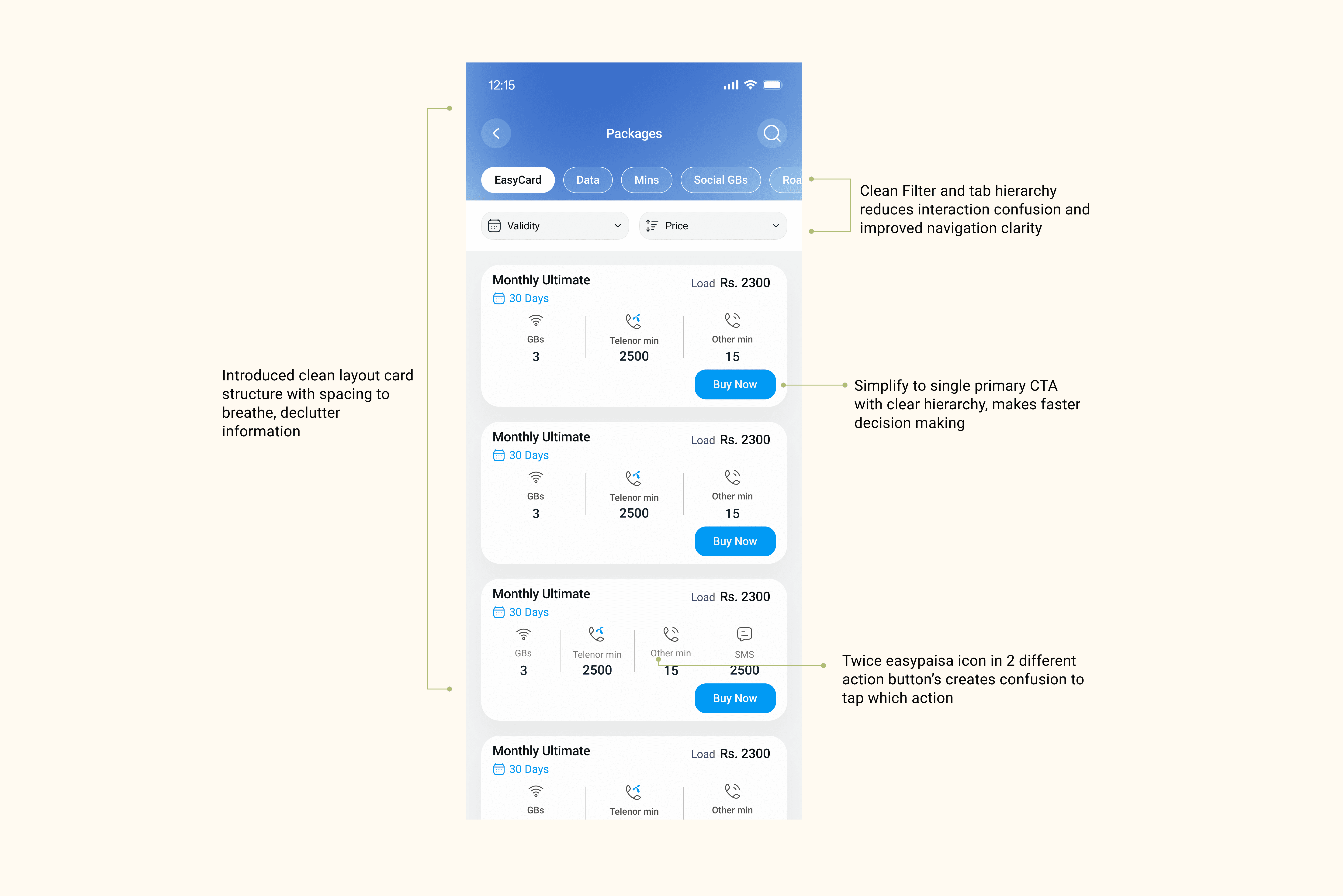
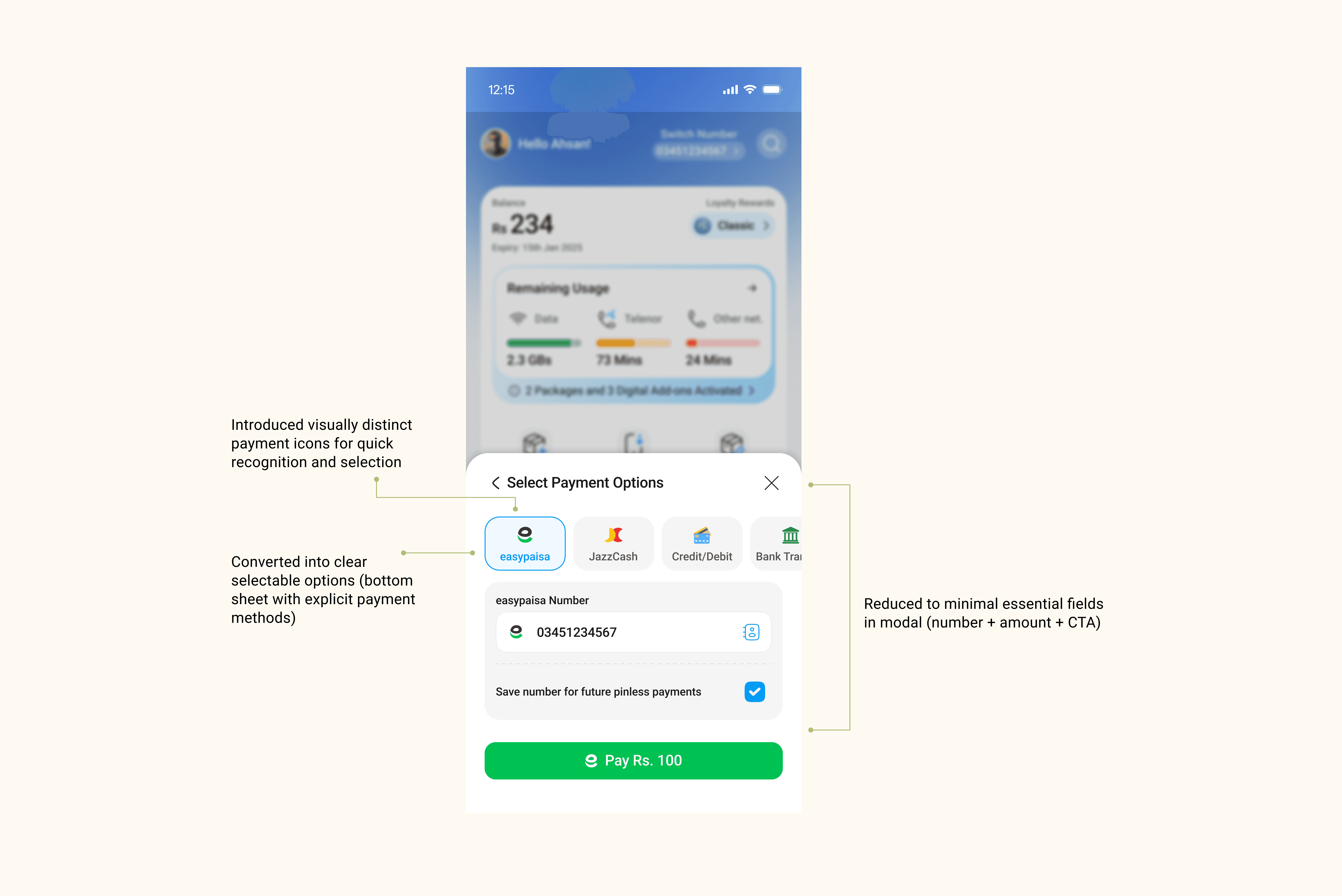
The previously deep nested package subscription journey was flattened using native inline filters and sorting controls. Users now complete the entire purchase — including payment — through a progressive bottom-sheet flow without a single full-screen navigation.
Resolved Redundancy
On the original Home screen, the same packages feature appeared three times under different labels — "Offers," "Packages," and "Make Your Own Plan." This was consolidated into a single, clearly labelled "Buy Package" action in the Quick Actions card.
Feature Spotlight — Packages & Payment Flow
The Most Broken Journey. The Biggest Redesign.
Of all the journeys in MTA, the package subscription and payment flow had the highest user drop-off, the most heuristic violations, and the deepest structural problems. It was treated as a standalone design sprint within the broader redesign.
Needs to be Fixed
◆
Top app bar outdated — height too tall, wastes above-fold space
◆
Conflicting primary color usage creating unclear proximity cues
◆
Sorting and filter tabs absent or non-native
◆
Confirmation modal repeats information already shown
◆
Inconsistent visual hierarchy throughout confirmation screens
Needs Improvement
◆
Too much pricing information (original + discounted + crossed-out) causes confusion
◆
Package details not prominently displayed
◆
Multiple CTAs per card — Easypaisa, VISA, Activate all visible at once
◆
Confirmation steps overloaded with redundant info
◆
Wrong UI element choice for selection (radio vs toggle)
Suggestions Applied
◆
Break flows into smaller, clearer steps
◆
Use bottom sheets for payment and confirmation
◆
Limit CTAs to one per screen to eliminate choice fatigue
◆
Use native UI elements for sorting
◆
Remove repeated known information from confirmation steps
Usability Testing — Packages & Payment Flow
Moderated task-based usability testing with 8 to 9 participants from Telenor's actual user base, grouped into three behavioral segments.
Frequent Users
89%
task completion rate
Despite initial resistance, frequent users adapted quickly within 1–2 taps. No participant failed to complete the full purchase.
Medium Users
92%
task completion rate
Highest scoring segment. Clean card layout with single CTA removed decision paralysis. Payment sheet described as 'much simpler'.
Low-Frequency Users
78%
task completion rate
Most improved segment vs old design. Real-time validation and progressive disclosure significantly reduced confusion at the payment step.
"An 86% task completion rate in a prototype test — before a single line of production code ships — is a rare signal. The design isn't speculative. The outcomes are already validated."
11 — Impact (Post Initial Launch)
What the number say
The core redesign covering Home, Packages, and Easyload was launched first. The following results are real product metrics from the first months post initial launch.
Prior year baseline
18%
YoY user growth
Pre-launch baseline
34%
Increase in digital recharge
SUS 52
79
System Usability Scale score
23 violations
3
Remaining heuristic violations
6.4 seconds avg
1.8s
Balance check time-on-task
~55% accuracy
87%
First-tap navigation accuracy
5 tabs
4
Navigation tabs — cleaner taxonomy
"A 34% uplift in digital recharge directly validates that reducing friction in the purchase flow converts to measurable business outcomes — not just better UX scores."
Trust
Users described the redesign as 'professional' and 'trustworthy'
Removal of duplicate features and inconsistent visual language addressed a subconscious credibility gap.
Efficiency
Infrequent users performed at parity with heavy users
In the original design, users who opened the app rarely were significantly slower. In the redesign, this performance gap narrowed.
Growth
18% YoY growth reflects improved retention, not just acquisition
Improvement in core task completion — particularly Easyload and package management — suggests the redesign meaningfully improved return usage frequency.
01
Data & Decision-Making
Data-Driven Design Enables Better Decisions
A key learning was the importance of having access to real product metrics early in the process. Without data such as drop-off rates, time-on-task, or feature usage patterns, design decisions defaulted to stakeholder inputs, heuristic evaluation, and competitive benchmarking. While these provided direction, they couldn't replace the precision of behavioural data.
Without Data — Relied On
◆
Stakeholder assumptions & team inputs
◆
Nielsen's heuristic evaluation
◆
Industry & competitive benchmarking
Moving Forward — Will Advocate For
◆
Define key metrics & KPIs before design begins
◆
Align design decisions to measurable outcomes
◆
Embed analytics access into the design process early
02
Stakeholder Management
Navigating Alignment in Ambiguous Environments
Working across multiple stakeholders with evolving requirements taught me that ambiguity isn't a blocker — it's a design problem. The skill is creating alignment through structured communication and evidence, not waiting for clarity to arrive.
How I Applied This
02
Used heuristic evaluations and usability testing to ground discussions in user behaviour, not opinion
03
Balanced competing inputs by tying every decision back to a user goal or business outcome
04